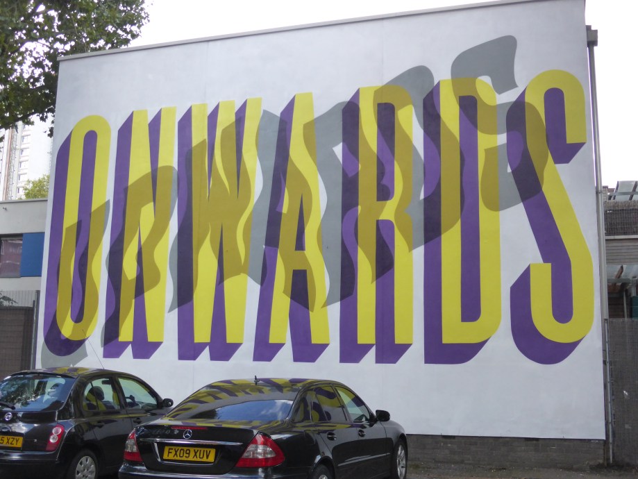
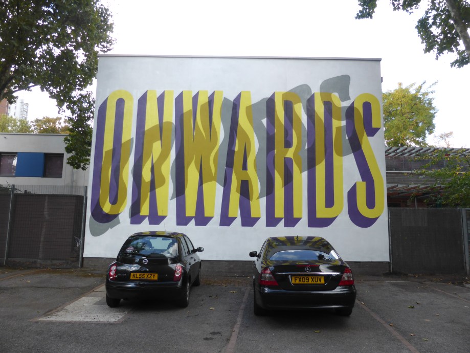
Earlier on today as we made a visit to Camden Town and we were delighted to stumble upon this fantastic typography collaboration ‘Onwards & Upwards’ from Pref Id & Gary Stranger. The pair whose works both in their own way meet as a fusion of Graffiti and Graphic Design have presented a piece very much in Pref’s trademark setting, but retaining their respective styling, namely letters presented in layers to create the desired phrase, creating typographical works on the street which are just absorbing and so well constructed, you find yourself staring intently trying to decipher the layers of letters, but when you see it for what it is, it finally becomes all so clear. The pair meet perfectly here with Gary Stranger’s distinct and bold letters for the word “Onwards” and Pref’s appropriately flowing grey letters for the accompanying and underlying “Upwards.”